Google has announced the new version of its Instant Previews feature. On 24th August 2011, a month ago, we were the first in the world to document Google’s testing of this feature.
The new mouse-over feature makes it easier to quickly view previews of websites in the search results without having to visit the website first.
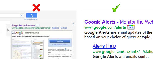
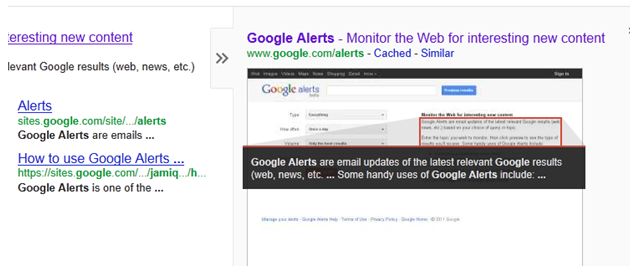
The change from Google’s last version of Instant Previews is quite significant in that rather than having to click on a small magnifying glass icon, an instant preview tab now appears when you hover over any part of the search result; you then simply hover over the tab to bring the preview into view.
The new Google Instant Previews can be accessed from Google’s organic results and in the PPC adverts at the top, as well as in the Site Links. Take a look at the video below to see how it works. [NO AUDIO]
Google +1 Button is Back
Since our article last month on Google’s testing, a couple of small things have changed, but the main change is that unsurprisingly Google’s +1 button has come back out of the Instant Preview area and now sits next to the website address, giving it more attention for users who are logged in. Why Google would want to test putting the +1 button in the instant preview area is a curious one.

Also of note is that the ‘Cached’ link now appears above the instant preview rather than alongside the web address. This reduces the clutter around the main search result and relegates a feature that was surely not used by the majority of Google’s audience.
Does the New ‘Instant Previews’ Make Search Easier?
Google’s announcement:
“Sometimes you’re searching for a page with a specific type of visual – like a seating chart when you want to buy baseball tickets – but can’t tell from the results page which one will have exactly what you’re looking for. Or you’ve already seen a specific page and would recognize it in an instant if you saw it again. You can now quickly glance at a preview of the page without having to click and see if it’s the page you want.”
Searching for a website that has a specific image on it is where Google Instant Preview comes into its own. It now takes just seconds to hover over the previews of 10 or so websites to find out which website has the photo you’re looking for.
What isn’t as straight forward is searching for textual content. As a searcher you still have to scan the tiny snippets of text that Google has identified with its red outlines.

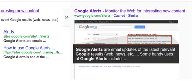
Google has changed the background colour of the text area to black to make the text stand out more, but it still lacks the stand-out nature of an image. Below we’ve enlarged the text on the instant preview and feel that increasing the text size could make it more useful to searchers; maybe Google will test this in the future?

What Does the New Instant Previews Mean for Website Owners?
Google has now made Instant Previews more obvious and it’s now more likely that people will evaluate your website visually before visiting, or not visiting as the case may be.
If the searcher doesn’t see what they’re looking for in that split second, then they will simply move their mouse onto the next preview and your website is gone.
A process which usually involves visiting your website is now void of that one big ‘time consuming’ step.
Will the masses actually use Google Instant Previews?
The actual Instant Previews feature isn’t new, but Google has obviously seen the need to make it more obvious and make their search results easier to use.
There’s a strong chance that a much larger proportion of Google’s audience will use it and this could mean that the percentage of searchers who visit your website will drop if they deem your website to be irrelevant.
That all depends on whether it does make it easier to evaluate pages; is there enough information in the preview’s text and visuals to decide not to visit your website?
The number of people using it is likely to increase over time and as a website owner you can’t afford to lose traffic.
How to Reduce the Impact of the New Google Instant Previews
Stand back and look subjectively at your website’s instant preview. Does your website look professional, does it look inviting? Does it look clean, uncomplicated and easy to use? Does your text look easy to read, rather than being grouped together in one or two big clumps?
Start with the aesthetics and get those right, then hopefully the content that Google highlights is the content that motivates the searcher to click.

