Last month I was the first person in the world to document Google’s testing of the new Instant Preview feature.
Today, a month later, Google has announced this new version of its Instant Previews feature.
The new mouse-over feature makes it easier to quickly view previews of websites in the search results without having to visit the website first.
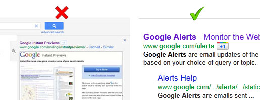
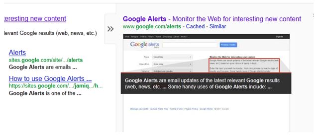
The change from Google’s last version of Instant Previews is quite significant in that rather than having to click on a small magnifying glass icon, an instant preview tab now appears when you hover over any part of the ad or organic search result; you then simply hover over the tab to bring the landing page preview into view.
The new Google Instant Previews can be accessed from the top Google ads and the organic results, but not from ads down the right-hand side.
Take a look at the video below to see how it works. [NO AUDIO]
Google +1 Button is Back
Since our article last month on Google’s testing, a couple of small things have changed, but the main change is that unsurprisingly Google’s +1 button has come back out of the Instant Preview area and now sits next to the website address, giving it more attention for users who are logged in. Why Google would want to test putting the +1 button in the instant preview area is a curious one.

Does the New ‘Instant Previews’ Make Search Easier?
Google’s announcement:
“Sometimes you’re searching for a page with a specific type of visual – like a seating chart when you want to buy baseball tickets – but can’t tell from the results page which one will have exactly what you’re looking for. Or you’ve already seen a specific page and would recognize it in an instant if you saw it again. You can now quickly glance at a preview of the page without having to click and see if it’s the page you want.”
Where Google Instant Preview comes into its own is when searching websites for a specific image. It now takes just seconds to hover over the previews of 10 or so websites in this situation.
What isn’t as straight forward is searching for textual content. As a searcher you still have to scan the tiny snippets of text that Google has identified with its red outlines.

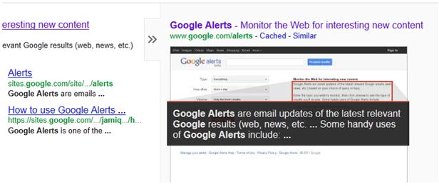
Google has changed the background colour of the text area to black to make the text stand out more, but it still lacks the stand-out nature of an image. Below we’ve enlarged the text on the instant preview and feel that increasing the text size could make it more useful to searchers; maybe Google will test this in the future?

How will Instant Previews Impact Google PPC?
At the moment there seems to be far more value in using Google Instant Previews to quickly find websites that host certain images than for finding more text based content.
Searching for products is where Instant Previews could have the biggest impact as it’s now much easier for buyers to compare the landing pages of all of the top PPC & organic search results before visiting any of the ecommerce websites.
This is another reason why ecommerce websites should use large, clean photos which really convey everything that’s good about the product.
How Could the New Instant Previews Affect Ad CTR?
The impact of Google Instant Previews isn’t just about eCommerce, but let’s use that as an example.
1. In the search in the video below we’re looking for ‘running shoes’ and in 1 or 2 seconds we can see that all of the top 3 ads seem to stock a good number of shoes. If we compare that with the organic results, the reduced ability to target specific landing pages with SEO becomes apparent. I can hardly see a running shoe in the previews of the top organic results. After this initial scan, my attention focuses in on clicking one or more of the top ads. In this scenario, where on first appearance the organic results seem to provide poor competition, ad CTR could increase. [NO AUDIO]
2. Next let’s try a slightly narrower search by including a brand name in the search term. The third ad illustrates that, now more than ever, it’s crucial to relate your landing pages to the search phrase you’re targeting, otherwise your CTR could drop. Bar charts and technical detail are not what I’m looking for, so I discard the third advert. The other 2 ads seem to provide a range of running shoes by this manufacturer. The landing pages of the organic results seem to lose out again with a sparseness of product photos, making me more likely to click on the top ads. In this scenario the ad CTR for ads 1 and 2 could increase.
3. Finally we look at a specific model of running shoe which has a range of colours. This time the organic landing pages catch up and the playing field is more level. In this example it’s harder to differentiate one site from the other. Strong photos could really be a deciding factor, especially if the searcher has a specific colour in mind, as well as of course, persuasive ad text.
Google has now made Instant Previews more obvious to users and it’s more likely that people will evaluate your website/landing page visually before visiting it, or not visiting it as the case may be.
If more people start to use Google Instant Previews, then it makes sense that the competition between the top PPC ads and the organic results could really hot up.
In the above examples the PPC ad previews bear up pretty well, but there are many other examples on the web where the landing pages of Google Adwords campaigns are poorly matched to the search term and so we can only conclude that CTR could go up or down depending on the competition. You may have a poor instant preview, but your competition could be worse.
Improve Landing Pages to Set Campaign Apart
What is clear is that this is another opportunity for you to set your campaign apart from competing PPC campaigns and competing organic results. If you want to increase CTR then this is another huge reason to make sure your landing pages closely relate to the keywords you’re bidding on and that you’re bidding on the right keywords.
How about Non-ecommerce Landing Pages?
As already mentioned, Instant Previews give more value to the searcher when there are specific images that they can relate to their search. Landing pages/previews that don’t have that same visual advantage, eg. ‘Home Insurance’, probably won’t see the same impact.
Does your Instant Preview Look Professional?
One other thing, stand back and look subjectively at your landing page’s instant preview. People can make trust judgements based on how professional a website looks. Does your website/landing page look professional, does it look inviting? Does it look clean, uncomplicated and easy to use? Does your text look easy to read, rather than being grouped together in one or two big clumps?
Start with the aesthetics and get that right, then hopefully the content in your ad and the content that Google highlights on your preview, is the content that motivates the searcher to click.

