Article by: Mark Reynolds, the founder and owner of GrowthbyTrust. Mark first applied SEO to a small business website in 2002. In every role since, he has used SEO to grow web enquiries for small businesses. He’s a trusted speaker, delivering SEO/Google Analytics workshops for Coventry & Warwickshire Chamber of Commerce and other organisations. Today he’s here to help you. Need Mark’s help? Get in touch.
I love a good bit of SEO nostalgia.
Check out the post below from 2011 when I was the first in the world to document Google’s testing of their incredible new Instant previews feature.
Almost a month after this post (23rd September 2011), Google launched the Instant Preview feature to the world.
Commenting on the contents of this specific post, Rand Fishkin, CEO at SEOmoz at the time said “SEO implications are big – more use of that preview pane could mean fewer clicks unless your UI/UX rocks.“
Isn’t it amazing to see how far the world moves on in the world of search. What Rand understandably thought was big, was eventually culled by Google.
Let’s go back to Wednesday 24th August 2011, with the original post, original screenshots and video of Google’s jaw-dropping new feature:
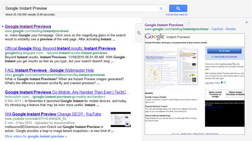
Today we came across what looks like a test from Google to improve the look and functionality of the Google Instant Previews feature in its search results. In the test, when you hover over any part of a result, a new larger magnifying glass button will appear to the right of the results, as well as the new preview pane sliding into place.

When you hover over this button, the instant preview of that search result then smoothly slides into place on the right hand side of the browser using a modern new transition effect.

You can also see an instant preview button appear next to the result’s site links when they’re hovered over.

Take a look at the video below to fully appreciate the transition effect that takes place when you hover over the new magnifying glass button. [NO AUDIO]
The actual ability of the preview to let you see the layout of a web page before clicking the search result isn’t new, but the new looking approach in the above test not only looks better, but it also reduces the clutter around the search result.

Gone is the ‘Cached’ link, as well as Google’s +1 button; they’ve both been moved into the preview pane, along with the ‘Similar’ link.
This move to de-clutter may help focus the attention of users on the information that matters. How many of Google’s millions of users have ever clicked on the ‘Cached’ link? I’m guessing, not a large proportion.
What may be more questionable is moving the Google +1 button into the preview area, where it’s not likely to be viewed as much.
I’m definitely up for anything that reduces clutter and it does seem like a good visual improvement.
At the time of writing Google’s new look Instant Preview feature doesn’t seem to have been rolled out. I have a feeling that the old/current magnifying glass (below) isn’t obvious enough and so if Google really thinks Instant Previews will help people then maybe the new larger button that appears before your eyes in the test will do the trick.
Let’s see if Google rolls it out to everyone.

UPDATE: 25th August 2011
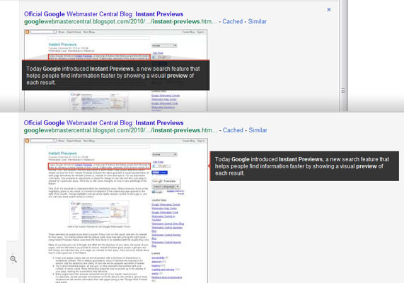
I’ve just started taking a closer look at the actual preview and since I wrote this post I’m seeing another change in Google’s testing. Google has got rid of the orange outline that emphasises the relevant text in the preview and replaced it with a black text box (see below).
It’s also apparent that Google is making much more use of the browser space. If you have a large monitor and you increase the width of your browser, the preview text repositions to the right of the image preview (see below). While the positioning may or may not have impact, the contrast of the black box itself should certainly focus more attention on the preview text and not just the image.

What’s the Effect of More People Seeing ‘Instant Previews’?
Commenting on the contents of this post, Rand Fishkin, CEO at SEOmoz said “SEO implications are big – more use of that preview pane could mean fewer clicks unless your UI/UX rocks.”
It will be interesting to see the effects on our SEO clients in Warwickshire, West Midlands and Bristol.
If more people do start using the instant previews to make a decision on which result is right for them, then Rand could be spot on. Websites would really have to ‘rock’.
If you take a minute to use ‘Instant Previews’ as it is currently, you will view web pages in a way we don’t usually – you’re generally seeing the majority of the page all at once. A lot of the time you’ll see a mishmash of content on the page. Rarely a good look!
One thing’s for sure, it won’t be a bad thing for website visitors if an increased popularity of Google’s ‘Instant Previews’ makes website owners pay more attention to the look of their websites.

